
Pantone color matching ensures precise reproduction for custom suits fabrics. Its standardized system eliminates guesswork, making it ideal for achieving consistent hues in high end suits fabric. Whether working with TR suits fabric, wool polyester rayon suits fabric, or polyester rayon fabric, this approach guarantees accuracy. It transforms custom suits fabric into a true reflection of individuality.
Key Takeaways
- Pantone matching helps get exact colors for suit fabrics.
- It makes talking to manufacturers easier and avoids mistakes.
- Checking fabric samples in different lights ensures correct colors.
Understanding Pantone Color Matching
What is Pantone Color Matching?
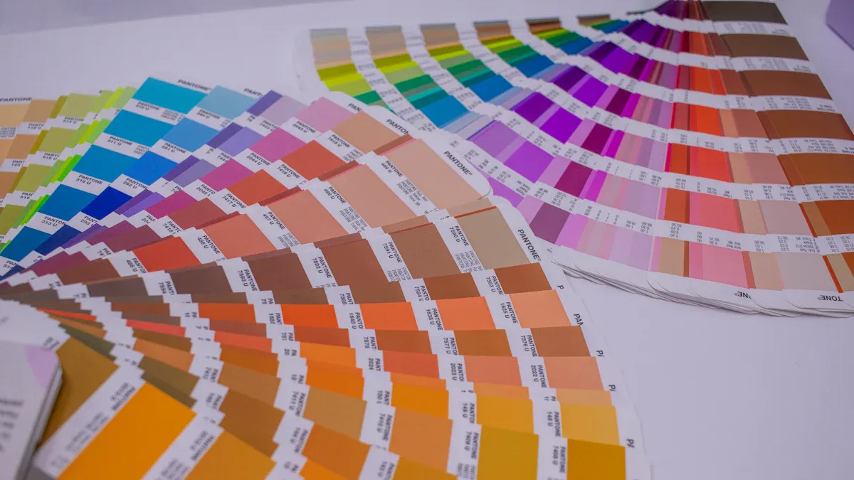
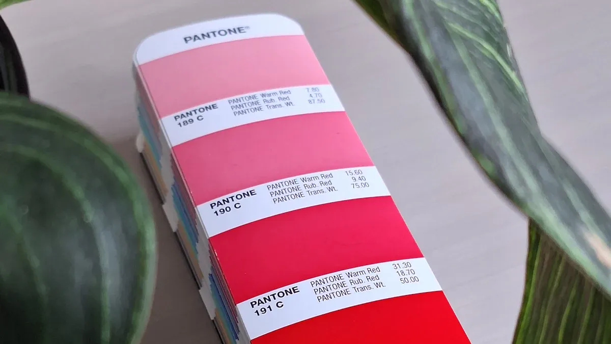
Pantone color matching is a standardized system that ensures precise color identification and reproduction. It assigns a unique number to each color, making it easy to communicate specific shades across industries. This system relies on 18 foundational base colors to create a palette of over 2,000 shades. Printers and manufacturers use a formula guide to mix these base colors and achieve the exact hue specified by the Pantone Matching System (PMS).
Here’s a quick breakdown of its technical specifications:
| Specification Type | Description |
|---|---|
| Color Numbering System | The Pantone Matching System (PMS) assigns a unique number to each color for easy identification. |
| Base Colors | PMS colors are created from a combination of 18 foundational base colors. |
| Total Colors Available | There are currently 2,161 PMS colors available for use in design and printing. |
| Formula Guide | A guide that illustrates all PMS colors with their corresponding base ink formulations. |
| Color Matching Process | Printers can mix base colors according to the formula to achieve any PMS color. |
This system eliminates guesswork, ensuring that the color you envision is the color you get. Whether you’re designing custom suits fabrics or branding materials, Pantone provides a reliable framework for consistency.
Importance of Pantone in Custom Suits Fabrics
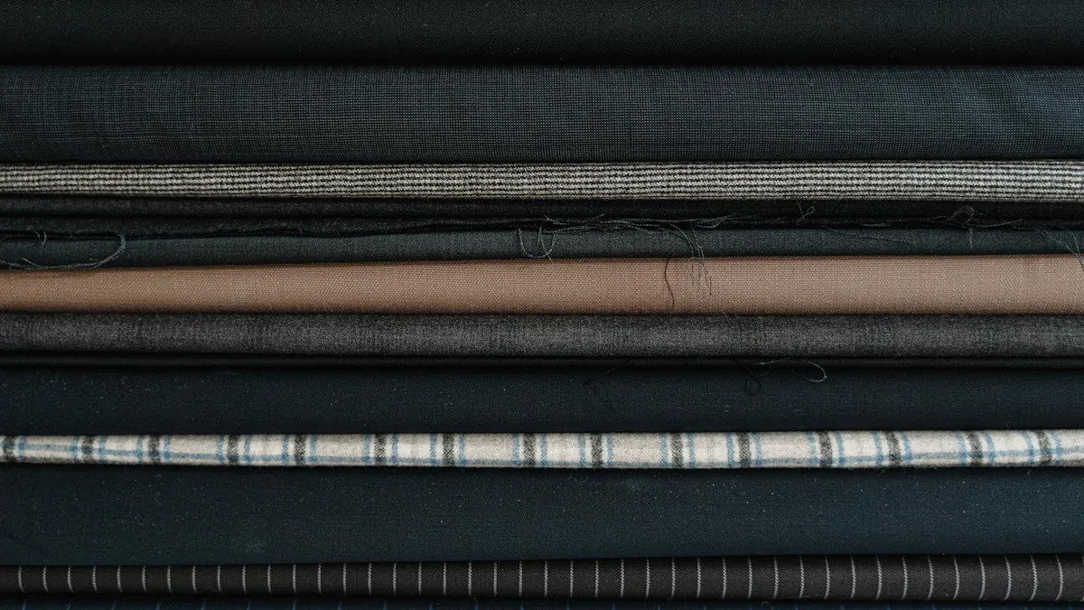
Pantone plays a critical role in achieving consistent colors for custom suits fabrics. In the fashion and textile industry, color consistency is essential for maintaining quality and meeting client expectations. Pantone’s standardized approach ensures that the same shade appears uniform across different batches of fabric, even when produced at different times or locations.
For example, the Pantone Fashion, Home + Interiors (FHI) resources include fabric swatches that help manufacturers match colors accurately. This is especially important for custom suits fabrics, where even slight variations in color can affect the overall look and feel of the garment.
| Evidence Type | Description |
|---|---|
| Color Communication | Pantone guides provide a standardized approach to color management, crucial for brand identity. |
| Textile Standards | The Pantone Fashion, Home + Interiors (FHI) resources ensure accuracy in textile production with actual fabric swatches. |
| Material Variability | Pantone Plastic Standard Chips help visualize colors on different materials, ensuring consistency across production methods. |
By using Pantone, I can confidently collaborate with manufacturers to ensure that the final product meets my exact specifications.
Benefits of Using Pantone for Fabric Dyeing
Using Pantone for fabric dyeing offers several advantages. First, it guarantees precision. The unique numbering system allows me to specify the exact shade I want, reducing the risk of errors. Second, it ensures consistency. Whether I’m working with wool, polyester, or blended fabrics, Pantone helps maintain uniformity across different materials.
Another benefit is its versatility. Pantone’s extensive color library includes shades that cater to a wide range of preferences, from classic neutrals to bold, vibrant tones. This flexibility makes it ideal for creating custom suits fabrics that reflect individual style and personality.
Finally, Pantone simplifies communication. When I share a Pantone color code with a manufacturer, they know exactly what I mean. This clarity speeds up the production process and minimizes misunderstandings. For anyone seeking professional results, Pantone is an invaluable tool.
The Process of Custom Dyeing for Suit Fabrics
Selecting Pantone Colors for Custom Suits
Choosing the right Pantone color for custom suits fabrics requires a methodical approach. I always start by considering the fabric’s substrate. The color must be achievable on the material I plan to use. For instance, wool and polyester may absorb dyes differently, so I ensure the selected shade aligns with the fabric’s properties. Reproducibility is another critical factor. The color must remain consistent across multiple batches, especially for large-scale production. To guarantee this, I rely on spectral data and precise dye formulations. These tools help me achieve the exact shade while maintaining accuracy over time.
Here’s a breakdown of the key attributes I evaluate during this process:
| Attribute | Description |
|---|---|
| Achievability | The color must be achievable in the substrate that you desire as an end-product. |
| Reproducibility | The ability to match a specified color consistently over time. |
| Spectral Data | The associated spectral data and dye formulation must be provided to ensure accuracy in color matching. |
By following this structured approach, I ensure that the final fabric reflects the desired aesthetic and meets professional standards.
Collaborating with Dyeing Professionals
Working with experienced dyeing professionals is essential for achieving high-quality results. I prioritize clear communication when discussing my requirements. Sharing the exact Pantone color code eliminates ambiguity and ensures the team understands my vision. I also provide details about the fabric type, as this influences the dyeing process. For example, blended fabrics like wool-polyester require specific techniques to achieve uniform color distribution.
During collaboration, I value their expertise. Professionals often suggest adjustments based on their knowledge of dye absorption and fabric behavior. I remain open to their recommendations, as they can enhance the final outcome. Regular updates and sample reviews keep the process on track. This partnership ensures that the custom suits fabrics meet my expectations and maintain consistency.
Tip: Always request a small test swatch before proceeding with large-scale dyeing. This step helps identify potential issues early and saves time and resources.
Techniques for Achieving Accurate Color Matching
Achieving precise Pantone color matching involves a combination of advanced techniques and meticulous attention to detail. I often rely on Dyed to Match (DTM) processes, which focus on tailoring the dyeing method to the specific fabric and color requirements. Precision color matching dye formulas play a crucial role here. These formulas are developed to optimize results based on the fabric’s yarn blend and dyeing conditions.
Before committing to full-scale production, I insist on testing sample swatches. This practice allows me to evaluate the color under different lighting conditions and make necessary adjustments. I also consider the variables that can influence the final outcome, such as fiber type and dye lots. Using trusted dye brands like Dharma Acid Dyes ensures consistency and quality.
Here’s a summary of the techniques I use:
| Technique | Description |
|---|---|
| Dyed to Match (DTM) processes | A method that focuses on achieving precise color matching through specific dyeing techniques. |
| Precision color matching dye formulas | Formulas developed for optimal results using specific yarn blends and dyeing conditions. |
| Sample test swatch | Recommended practice to ensure accuracy before dyeing large quantities, accounting for variable dyeing conditions. |
| Use of specific dye brands | Certain brands like Dharma Acid Dyes and Jacquard are suggested for achieving the closest color match. |
| Consideration of variables | Factors such as lighting, fiber type, and dye lots can influence the final color outcome, necessitating adjustments. |
By combining these techniques, I achieve accurate and consistent results, ensuring the custom suits fabrics meet the highest standards.
Overcoming Challenges in Pantone Color Matching
Addressing Digital vs. Physical Color Differences
Digital color representation often differs from physical results. I’ve learned that screens display colors using RGB or HEX codes, while Pantone colors are designed for physical reproduction. This discrepancy can lead to mismatched expectations. To address this, I always rely on physical Pantone swatches rather than digital previews. Viewing the swatches under natural light ensures accurate perception.
When collaborating with manufacturers, I emphasize the importance of using Pantone’s official guides. These tools eliminate confusion and ensure consistency between digital designs and fabric outcomes. I also recommend avoiding reliance on uncalibrated monitors, as they distort color accuracy.
Tip: Always request physical samples of dyed fabric before finalizing production. This step bridges the gap between digital designs and real-world results.
Managing Fabric Texture and Dye Absorption
Fabric texture and dye absorption significantly impact color matching. I’ve encountered situations where the same dye produces different results on smooth and textured fabrics. To mitigate this, I analyze the fabric’s properties before selecting a Pantone color.
Several measurable factors influence dye absorption. For example:
| Factor | Description |
|---|---|
| Humidity | Affects color in cotton due to moisture regain; must be controlled to ensure consistent dye results. |
| Temperature | Influences color perception; cold and warm standards can show different colors. |
| Light | Can alter color appearance; some dyes change color when exposed to light. |
I work closely with dyeing professionals to control these variables. Testing swatches under different conditions helps identify potential issues early. This approach ensures the final fabric matches the intended Pantone shade.
Ensuring Realistic Expectations for Results
Achieving perfect color matching requires realistic expectations. I’ve found that slight variations are inevitable due to factors like dye lots and fabric composition. Communicating this to clients upfront prevents misunderstandings.
I focus on educating clients about the limitations of dyeing processes. For instance, blended fabrics may absorb dyes unevenly, resulting in subtle differences. I also highlight the importance of lighting conditions, as colors appear differently under artificial and natural light.
By setting clear expectations, I ensure satisfaction with the final product. Transparency and proactive communication are key to overcoming challenges in Pantone color matching.
Tips for Successful Custom Dyeing
Testing Swatches for Color Accuracy
Testing swatches is the cornerstone of successful custom dyeing. I always begin by requesting a small fabric sample dyed to the specified Pantone color. This allows me to evaluate the shade under different lighting conditions, such as natural daylight and artificial light. Variations in lighting can significantly alter the perception of color.
To ensure accuracy, I use a cotton swatch card as the physical standard for comparison. Relying solely on Pantone books can lead to discrepancies, especially when dealing with textured fabrics. I also recommend using spectral data to support color matching. This data provides precise measurements that help maintain consistency across multiple batches.
Tip: Always specify the primary light source and intended use of the fabric when testing swatches. This ensures the final product aligns with its real-world application.
Communicating Clearly with Manufacturers
Clear communication with manufacturers is essential for achieving desired results. I prioritize providing physical standards, such as dyed fabric samples or cotton swatch cards, rather than relying on verbal descriptions. This eliminates ambiguity and ensures everyone works toward the same goal.
Using descriptive terms instead of percentages when discussing color adjustments prevents misunderstandings. For example, I describe changes as “slightly warmer” or “more muted” rather than “10% darker.” Regular meetings and visual aids further enhance clarity. Collaboration software and digital communication platforms streamline the process, especially when coordinating across departments like design, sampling, and production planning.
| Departments Requiring Clear Communication | Tools for Effective Communication | Best Practices |
|---|---|---|
| Design | Clear documentation | Establish clear communication channels |
| Sampling | Standardized processes | Use visual aids to support instructions |
| Manufacturing | Collaboration software | Encourage feedback and open communication |
Planning for Potential Adjustments
Flexibility is key in custom dyeing. I always plan for potential adjustments to account for variables like fabric texture, dye absorption, and lighting conditions. Even with precise Pantone matching, slight variations can occur due to dye lots or fiber composition.
To mitigate these challenges, I work closely with dyeing professionals and maintain open communication throughout the process. Regular updates and sample reviews help identify issues early. I also educate clients about the limitations of dyeing processes, setting realistic expectations for the final product.
Note: By anticipating adjustments and maintaining transparency, I ensure the custom dyeing process remains efficient and delivers high-quality results.
Pantone color matching plays a vital role in achieving precise and consistent results for custom suits fabrics. Understanding the dyeing process and addressing challenges ensures professional-quality outcomes. I always recommend working with experts to navigate complexities and achieve the best results. Their guidance transforms ideas into flawless, personalized fabrics.
FAQ
What is the best way to test Pantone colors on fabric?
I always recommend testing small swatches under natural and artificial lighting. This ensures the color matches expectations before committing to large-scale production.
Tip: Use a cotton swatch card as a physical reference for accurate comparisons.
Can Pantone colors match perfectly across different fabrics?
No, slight variations may occur due to fabric texture and dye absorption. I work closely with dyeing professionals to minimize these differences and achieve consistent results.
How long does custom dyeing with Pantone matching take?
The timeline depends on fabric type, dyeing complexity, and production scale. On average, I plan for 2-4 weeks, including testing and adjustments.
Note: Always communicate deadlines clearly with manufacturers to avoid delays.
Post time: May-23-2025